Where To For Our Olympics

Now the Games of the XXX Olympiad (that’s London 2012 Olympics for us mere mortals) have come to a close, there will be much hand-wringing, soul-searching and other colourful metaphors used within the offices of the Australian Olympic Committee. The AOC forecast fifteen Gold Medals for Australia at this Olympics, not quite the seven we actually received, and at times we ranked on the Gold Medal Tally behind well-known Olympic super-powers like Cuba and New Zealand (g’day neighbours!). This is not to say that our athletes didn’t perform well, that it’s only about bringing home The Gold, or that I could somehow qualify for more than sweat-wiping duty of athletes at the games. However, the AOC is all about exchanging cash for gold and they will now be looking for more cash given that there will be a demand for more gold.

In some ways, it’s an Australian success story. The Australian Institute of Sport was established in 1980, four years after our zero-gold result at the Montreal Olympics. In the years that followed, Australia averaged more than nine gold per Summer games (including London 2012). What is sometimes overlooked is that this has been a scientific triumph as much as a sporting one. While it is the athletes standing on the podium receiving the medals for all to see, it would be justified to also see up there the army of sports scientists and specialists in sports medicine standing there that Australia has willed into being to create our international success. It is probably the Australian scientific organisation with the most influence on the international scene in recent years, but it’s disguised as sport to keep the masses happy. Thanks to the AIS, a country of around 20 million people was able to rank fourth at the Olympics as recently as 2004.

But eventually the limitations of our population size and ability to fund elite sport was going to catch up with us. We had a temporary advantage due to the skills and knowledge in the AIS and the system around it, but information wants to be free. Australian coaches, scientists and even athletes are now helping out other nations. Even Australia’s first individual gold medalist at the London 2012 games, Tom Slingsby, wasted little time after the games to head to the US to help the team defend their America’s Cup title. This is not a slight on the patriotism of those individuals, but recognition that information advantages last for only so long. We now need to find another approach to win a disproportionate share of the Olympic gold.

Our new competitive advantage could be our women. While women made up 46% of the Australian team, wins in their sports accounted for 57% of our Olympic medals (note also that only 46% of the opportunities for a medal are eligible to women). Our first gold medal of these games was from women, and it stood as the only one for nine days. However, while wins in women’s events were responsible for 57% of the medals, they were responsible for only 43% of the gold. Something is not quite right.

Even before the games started, there was some contention that Australia’s female athletes were treated differently from the male athletes. Media reports revealed our women’s basketball team flew to London in economy class while the men’s team flew business. This may be just be the rumblings of a couple of disgruntled athletes, but let’s see if there are some stats that could shine some light on a systemic difference between the men’s and women’s performance at the games.

Despite winning more medals, our team’s women’s medals converted to gold less often than the men’s medals in London. Just 15% of the women’s medals were gold, while 27% of the men’s medals were gold. This difference of 12% between their ability to convert medals to gold, despite coming from the same country, being selected by the same process, and being supported by the same institutions, turns out to be pretty poor compared with other nations. The following table compares all countries who won at least a dozen medals (just so we can have some level of statistical validity):

Rank Country Womens Gold Mens Gold Womens Medals Mens Medals Womens Conversion Mens Conversion Delta
1 BLR 1 2 9 4 11% 50% 39%
2 IRI 0 4 0 12 0% 33% 33%
3 JAM 1 3 5 7 20% 43% 23%
4 UKR 2 4 10 10 20% 40% 20%
5 AUS 3 4 20 15 15% 27% 12%
6 FRA 4 7 15 19 27% 37% 10%
7 CHN 21 18 52 38 40% 47% 7%
8 GER 4 9 17 31 24% 29% 6%
9 RUS 12 12 44 38 27% 32% 4%
10 CUB 1 4 3 11 33% 36% 3%
11 ESP 2 1 11 6 18% 17% -2%
12 GBR 12 20 26 45 46% 44% -2%
13 NED 4 2 15 9 27% 22% -4%
14 HUN 3 5 6 11 50% 45% -5%
15 JPN 4 3 17 21 24% 14% -9%
16 CAN 1 0 9 9 11% 0% -11%
17 USA 29 17 59 46 49% 37% -12%
18 NZL 3 3 6 8 50% 38% -13%
19 ITA 3 5 8 20 38% 25% -13%
20 KAZ 4 3 6 7 67% 43% -24%
21 BRA 2 1 6 11 33% 9% -24%
22 KOR 5 8 7 21 71% 38% -33%

Australia comes 5th worst, out of 22 countries, right behind Belarus, Iran, Jamaica and Ukraine. Not exactly the company we’d chose to validate our support for women athletes.

If Australia had lifted women’s events conversion to parity with men’s events, we would’ve gotten another two gold on top of our other seven, and we would’ve ranked eighth rather than tenth. So, if the AOC is looking for somewhere to spend to increase our performance in the face of the declining benefits of our leading science, I suggest ploughing money into women’s sport.

NB. For the purposes of the above analysis, I’ve looked at whether sports events are male-only events (like Men’s Marathon), female-only events (like Rhythmic Gynamistics) or support both (like Equestrian or Mixed Doubles in Tennis). When determining if an event is a women’s event, I’ve included the two latter categories, and similarly men’s events include the first and last category.

For those that are interested, my analysis spreadsheet is also available. A more thorough analysis would look at previous summer and winter Olympics to see if this was just a one-off, but I leave that as an exercise for the interested reader.

Increasing the competition reduces competition

I know the rule is: write what you know. So, I also know I’m going out on a limb here writing something about sport. Specifically, writing about AFL. But, this idea has got into my head, and I think writing it down is the only way to let it out.

Due to utter chance, the weekend newspaper fell open on an article about the AFL competition format, and after glancing at it, I found it to be really interesting. The gist of it was that the AFL has consciously shaped its teams to create a level playing field, through salary caps and priority draft picks for bottom teams, with the result that there is a good rotation of teams winning the grand final, and the sport has achieved enduring popularity. And it doesn’t hurt that they’ve been able to translate that popularity into a pretty decent TV rights deal.

However, it appears that while there is a good rotation of top teams, in recent years, those top teams are typically (and curiously) much better than the rest of the competition. According to the article, since 2000, Essendon, then the Lions, Port Adelaide, Geelong, St Kilda and now Collingwood have had long runs of wins, trouncing all the other teams for a reasonable period of time.

It strikes me that another way that the AFL has shaped their competition may be leading to this very outcome: growing the number of teams. Despite their efforts to limit and reset the strength of the teams each season, there is always going to be a distribution of ability across the set of teams. A spread of ability will exist, even if concentrated, so there can still be outliers. To put it another way, even if the standard distribution is smaller, the probability of a team falling outside a s.d. of the mean is still the same.

According to Wikipedia’s page on the AFL, back in 1982 there were just 12 teams, and this has increased little-by-little over the years to the current 17 teams, with 18 teams are proposed for next year. If we look at the probability of there being an outperformer in the mix (for discussion’s sake, let’s define that as a team with an ability two standard deviations above the mean), it increases from about 1-in-4 for a 12 team competition to about 1-in-3 for an 18 team competition.

# Teams Year P(one or more outperformers)
12 1982 0.241
14 1987 0.275
15 1991 0.292
16 1995 0.308
17 2011 0.324
18 2012 0.339

On one hand, the AFL’s actions are intended to make teams as similar in ability as possible to promote healthy competition. Ironically though, it seems their actions in increasing the size of the competition might be working against this to improve the chance than a season will have a dominant team.

Although from the AFL’s point of view, if the driver of their policies is not competition but popularity, then as long as the new teams are introduced in new areas, the loss of popularity from impacting competition is likely more than made up by the increase due to the additional of new supporters.

How unexpected are 1-in-100 yr events?

I was chatting to someone about once-in-a-century events, and I was reminded of a book I read a while back which pointed out that understanding probability is a pretty recent thing. In fact, there haven’t been that many centuries in which people could talk knowledgeably about 1-in-100 years events.

(I should probably put a disclaimer right here that, just as it seems any public post  about poor grammar is bound to be riddled with grammatical errors, my post about probability is going to be full of  mistakes. So, I promise to fix them, if they are pointed out to me.)

A funny thing about 1-in-100 year events, like 1-in-100 year floods, or storms, or market busts, is that they can appear to come along more frequently than once every hundred years. But it looks like we’re stuck with the name.

A 1-in-100 year event is simply one that has a 1% chance of happening in any particular year, which means that, mathematically, you would “expect” there to be one, on average, every hundred years. But of course, some centuries will have more or less of them.

In fact, (making assumptions about the distribution of events,) you would expect 37% of centuries to never have a particular 1-in-100 year event. You also get exactly one 1-in-100 year event in around 37% of centuries. The rest (26%) have more than one.

While more than a quarter of centuries can see multiple occurrences of a 1-in-100 year event, it’s worth asking: how many times can such an event crop up in a century before you start to wonder if it’s really still a 1-in-100 year event. How many occurrences of 1-in-100 year events should you actually expect?

The answer depends on the threshold for unlikeliness. A reasonable standard might be that anything less than 5% probable is pretty improbable. Back in high-school, playing D&D role-playing games, throwing a 20 sided die and getting a 20 (i.e. a 5% chance) was enough to get you special results. It came up a few times every game, but it was something pretty unlikely indeed. So, let’s use that standard for now. (It’s also common elsewhere.)

So, how many occurrences of a 1-in-100 year event in a single century are needed before we get to a level that’s less than 5% likely (or, you would expect to occur in less than one century out of twenty)?

The answer is 4. It’s only when you get four of a 1-in-100 year event happening in the same century that you might want to start questioning whether something else is going on, because it’s all starting to get a bit improbable. Four or more of such an event should crop up in less than 2% of centuries.

So, in summary, you shouldn’t be shocked to see three of a 1-in-100 year event occur in the last hundred years – it’s perfectly expectable.

Three is not the magic number

About a week ago, Demographia published their 7th Annual International Housing Affordability Survey. They picked up some press for finding that Sydney was the least affordable major housing market outside of Hong Kong, and Melbourne wasn’t that much better. Both were labelled “severely unaffordable”.

And while there is some irony in using the term “unaffordable” to describe the prices at which actual sales occurred (in any case, I agree that Australian capital city houses are expensive), it is the methodology of the survey that I want to nit-pick. It is based on a ratio that Demographia call the “Median Multiple”, which is calculated by dividing the median house (i.e. not apartment) sale price in that market for that period by the median household income for that market at that point in time. Apparently, such a measure is endorsed by such august bodies as the UN, the World Bank and Harvard.

I have previously talked about the mistakes that can be made in comparing two different medians, and it should be clear that there is no reason to assume any particular relationship between (say) today’s median Melbourne household income and the median sale price of a house in Melbourne over the last quarter. Ideally, the median should be calculated on the set of individual house affordability ratios, rather than a ratio calculated from the medians of two somewhat independent sets.

But the major issue I have with the report is that it picks, seemingly out of the air, the value “3.0” as value that separates unaffordable markets from affordable markets, as if it is some kind of universal constant. In fact, the value seems to be chosen principally because, in the past, affordability ratios were less than 3.0:

As Anthony Richards of the Reserve Bank of Australia has shown, the price to income ratio was at or below 3.0 in Australia, Canada, Ireland, New Zealand, the United Kingdom and the United States until the late 1980s or late 1990s, depending on the nation.

In fact, it should be clear that in a country like Australia, and specifically in cities like Melbourne, you would expect their Median Multiple figure to generally increase over time. Hence, there is no constant value that can be used for this ratio to indicate whether the housing market is out of whack.

For the Median Multiple to increase, basically median property values need to grow faster than median income. From my point of view, there are two obvious drivers for this growth to occur.

1. Gentrification

The Australian Housing and Urban Research Institute (AHURI) recently published a report on the gentrification of Melbourne and Sydney. (Essentially, this is when the existing residents of an area are displaced by a wealthier demographic.) For Melbourne, the regions of Maribyrnong and Northcote were identified as undergoing gentrification.

In such cases, property prices rise because people with higher incomes move into the neighbourhood. Actual incomes don’t necessarily rise at all – it’s just people moving around.

When an area has little ability to accommodate the displaced, e.g. through supporting greater housing density from subdividing lots or building apartment blocks, they need to find somewhere else to live. According to AHURI, displaced residents commonly relocate to an adjoining suburb (e.g. in 44% of cases of employed renters or 38% of owners). As they note, this in turn creates a “rippling effect” of gentrifying another region, and then another.

2. Trading Up

A major constraint to purchasing property is the ability to borrow money. First Home Buyers feel this pain worst of all, because (unless a significant deposit has been saved) they typically borrow between 80-90% of the  purchase price.

However, everyone else in the market (by definition) has already purchased a home. So, when trading up, any additional amount to be borrowed will depend on the difference between the value of the current property and the value of the next.

Since banks limit the amount they lend based on a household’s income levels, clearly if a purchase relies principally on borrowing, it will be constrained by income level. But, if a purchase makes use of the equity in an existing home, it can go beyond income level.

Admittedly, this requires property values to grow, in order for the home owner to build up equity. So, it’s somewhat circular to argue that growth in property depends on growing property values. However, the growth in equity is typically much faster than the growth in the underlying property value, which is why subsequent properties can be purchased at a level equivalent to growth faster than income.

For example, a property purchased on a 10% deposit will, after five years, have had its equity grow the equivalent of about 30% per year, if the underlying property value grows just 5% per year for that period (assuming the mortgage isn’t paid down at all). Or more specifically, a $400k property on a $360k mortgage will end up as a $510k property with $150k of equity under those conditions. If the household income has also grown during that period, then the mortgage that could be serviced at the same level (as the mortgage at time of purchase) will have grown at the same rate. Putting that together with the increased equity is how the purchase price of the next home grows faster than income, while keeping the portion of income used to service the loans at about the same.

Australia has a large proportion of home owners as possessors of property. The recent AHURI policy bulletin on Australia’s changing patterns of home ownership noted that the home ownership level continued to remain around 70% of the population. Together with tax treatment that allows home owners to sell their property without any tax implications (versus, say, investors who would be up for GST), this creates an environment where trading up is encouraged.

Concluding remarks

So, if you’ve read this far, you’ll hopefully now agree that the Median Multiple price-to-income ratio is likely to increase over time in Australia, and hence there is no constant level of affordability that relates to it. 3.0 is not the magic number of affordability.

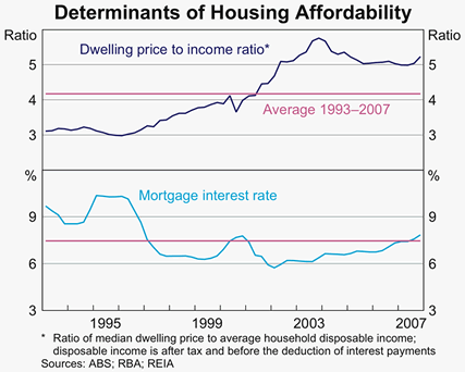
To conclude, I will leave you with a graph from an RBA speech on housing costs showing how, as you’d expect, the  price-to-income ratio for Australian property has fluctuated, but trended up over the last 15 years (blue line).

Lies, Damn Lies and Medians

When I first got involved in property investing, I wrote a little program that scoured the real estate websites for details of properties that were in areas interesting to me. One of the stats that it tried to calculate was the average rental yield (the rent divided by the purchase price) for different areas. Unfortunately, the values I was getting back were utter rubbish.

After looking closer at the data, I realised that I’d fallen for a classic beginner’s mistake: I had tried to compare median values.

The median is an “average” measure of a set of values where there are just as many values smaller than it as there are larger than it. If there are five houses worth $100k, $120k, $125k, $190k and $250k, then the median house value is $125k (the middle one).

Medians are widely used by real estate agents because they are easy to calculate, aren’t skewed by the effect of a really expensive or really cheap property coming onto the market, and provide a simple message to buyers. They state how affordable an area is – if you can afford the median, then you can afford the majority of homes for sale in an area.

However, my mistake was comparing two median values in an area: 1) the median rent  and 2) the median sales price. The set of properties available for rent was composed of completely different dwellings to the set of properties available for sale. For example, the median rent might have come from a 2 bedroom unit, while the median sale might have come from a 3 bedroom unit. As a result, the yields being calculated were much too low.

My mistake in comparing medians is repeated by many in the media every week in calculating property growth by comparing the median from one period with the median from another period. To be fair, it’s not entirely their fault, as they get their data from real estate agents.

Statisticians are aware of the problems with using the median for calculating growth rates and have come up with three improvements. Christopher Joye has written a detailed overview, but I’ll provide my potted summary.

Stratified Median

The Australian Bureau of Statistics (ABS) and Australian Property Monitors (APM) both use an approach of grouping properties into related sets (stratifying the data) prior to computing medians. If the groupings are done properly, then any skewing in one group will not affect another group too much, so data from different periods should be more comparable. However, it doesn’t eliminate the problem that properties sold in different periods might not be comparable in the first place.

Repeat Sales

The main approach used by Residex is based on calculating the growth rate of properties sold in a given period based on how much they sold for last time. Comparing a property with itself clearly doesn’t have the same level of issue as comparing medians. However, a property might have been renovated (or even completely demolished and rebuilt) since its last sale, which adds a wrinkle to the calculation. Also, sales of new buildings cannot be included since there isn’t a prior sale to compare them with.

Hedonic Method

The hedonic method is less interesting than it sounds, but is the main approach used by RP Data. In this method, sale data is combined with data on the nature of each property, e.g. precise location, land size, number of bedrooms, number of bathrooms, etc. In this way, like can really be compared with like, and more accurate growth rates can be calculated for properties in different areas. However, this approach is only as good as its data, and we need to trust that the statisticians at RP Data have gotten the good stuff. Also, historical data for all of these additional details are hard to find, so it’s not possible to do comparisons as far back as with the other approaches.

In conclusion, it is clear that the three improved approaches all have their strengths and weaknesses, but all are superior to the plain median. I was never able to update my little property stats program to collect enough data to make proper comparisons, but at least I learned the pitfalls of comparing medians.

Where have all the people gone?

It turns out they’ve all gone to Queensland.

The above is from the ABS Year Book Australia, 2008 and, sucker for stats that I am, I’ve been checking it out. This diagram actually refers to the interstate migration from 2005-06, and so it shows some of the migration to W.A. that drove the property boom that happened around that time.

Amusingly, every state is sending a significant number of people to Queensland (in particular, NSW). But there isn’t a significant number of people moving to NSW from anywhere. If people weren’t having babies, or migrating to NSW from overseas, it would be going backwards.

Support Pink Ribbon Day, but don’t forget the men

This coming Monday (22nd October) is Pink Ribbon Day. As everyone would know, it is supporting breast cancer research, which is a good thing. People (ok, women) at my train station sell ribbons for this charity, but I’ve never seen anything at all comparable for any cancer associated with men. Now, I know that there are a small fraction of men who do suffer from breast cancer, but in the main, research and support for “female cancers” like cancer of the breast, cervix, ovary or uterus are discussed and promoted significantly more than for “male cancers” like cancer of the prostate or testis.

In the past, I’d just assumed that this was because these afflictions in women outnumbered the cases in men, and the attention on them was warranted because it was another case of women simply being shafted for being female. Men seem to get things easy, and all these cancers were the universe picking on women again, just like while Viagra was approved quickly in Australia, RU-486 isn’t really available anywhere, or like GST on tampons. However, in this case, the roll of the dice has favoured the women, and it is men whom the universe has picked on. Cases of some male cancers outnumber the females ones. By quite a bit.

Cancer statistics are tracked in a lot of detail in Australia. The Australian Institute of Health and Welfare publishes a mountain of stats on cancer, although some stats are available up to only 2003 so far. So, in 2003, while there were 11,889 instances of breast cancer detected, and 2,720 deaths from it, there were 13,526 instances of prostate cancer found, with 2,837 deaths. Not that this is a competition, but instances of prostate cancer were 14% higher than for breast cancer. Why aren’t there guys at my train station selling ribbons for that? The Prostate Cancer Foundation should get a move on.

However, when all of the cases of “female cancers” listed above are totalled-up, they do outnumber the “male cancers”. Specifically, in that year, there were 14,164 instances and 2,854 deaths from “male cancers” and 15,311 instance and 3,956 deaths from “female cancers”. That’s almost 40% more deaths on the women’s team. So, there is a strong case to be made for emphasising “women’s issues” (particular for ovarian cancer, which looks pretty lethal from the stats). However, other types of cancer than breast cancer do need a look-in occasionally!

The BOM gets it wrong

Well, we all know that they get it wrong, but that’s not surprising since it’s a tricky job to predict the future. However, since they don’t ever tell us how accurate they are, we never knew exactly how wrong they were. Until now.

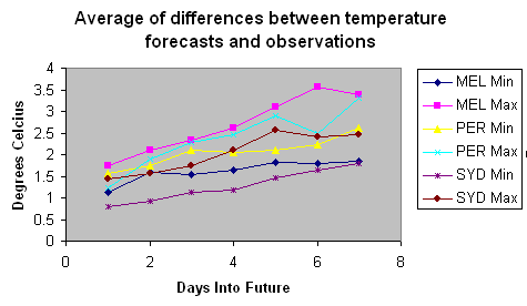
Average of differences between temperature forecasts and observations (Melbourne, Sydney and Perth)

The chart above is the result of some analysis on the data I collected over a month (between 25th February and 25th March 2007) for the cities of Melbourne, Sydney and Perth. The first thing you’ll notice is that the 7-Day forecasts are not as accurate as the 1-Day (i.e. tomorrow) forecasts, and that as the forecasts head off into the future, they get less accurate. This is as you’d expect.

Other things to notice are that (i) Maximum temperature forecasts are generally less accurate than Minimum temperatures, (ii) The Melbourne Maximum temperatures are the least accurate, while Sydney Minimum temperatures are the most accurate, and (iii) none of the curves are heading towards zero, i.e. the forecasts for the following day are still a surprise.

Since the data is collected over the course of only one month, it’s hard to say if this sample is representative of all Bureau of Meteorology forecasting, but at least we now have some idea of their accuracy. The rule of thumb seems to be that the next day forecast will be out by on average 1.5 degrees, and the 4-day forecast will be out by on average at least 2 degrees. This is better than I thought it was going to be, to be honest.

I’ll probably continue to crunch the numbers and see if anything interesting comes out, but I think I’ve won my bet.

Forecasting Conspiracy?

Weather Station, MelbourneOn the weekend, I (perhaps impulsively) agreed to a bet with a friend who claimed that Melbourne’s weather forecasts are accurate, while I suggested that they were slightly better than totally random. I am to record the 7-day forecasts for the next month and see how accurate the 4-day forecast is for Melbourne (compared with say, Sydney or Perth).

Since the Bureau of Meteorology does not publish their historical forecasts on their website, or indicate their forecasts’s probabilities, I think they must be embarassed by how imperfect their art is (at least when it comes to Melbourne). In a month’s time, we’ll know if that’s true, or if there’s a more likely explanation…